CSS Grid
Over the years, developers have been trying different methods for laying out content in the browser; going from tables to float, flexbox (which did really well, actually) and now Grids, which are presently the most powerful layout system in CSS.
So what are CSS Grids?
- It is a layout system, which excels at dividing a page into major regions. It introduces a series of properties that allow us to create grid structures and control the placement and sizing of grid items using CSS. We are able to use media queries to adapt our grids to different contexts, can rearrange the grid items independent of their source order – allowing us to shift items around based on varying contexts, without having to change the underlying markup.
- It is 2-dimensional system, meaning it can handle both columns (vertical) and rows (horizontal).
- With Grids, you can apply CSS rules both to a parent element (Grid Container) is children (Grid Items), which allows for more robust designs
- It is similar to Flexbox (which, one-dimensional), but more versatile and can be used in tandem with flexbox
There are lots of brilliant online resources, which go into a lot more details, so in this article i will outline the basics to get you started.
Defining a grid
- To define a Grid use
display:gridordisplay:inline-gridon the parent element. - You can then create a grid using the
grid-template-columnsandgrid-template-rowsproperties. - The
grid-gapproperty can be used to create a gap between columns and rows. This is a shorthand forgrid-column-gapandgrid-row-gap, which can be set individually.
<div class="container">
  <div class="item item-1">1</div>
  <div class="item item-3">2</div>
  <div class="item item-3">3</div>
</div>
.container {
  display: grid;
  grid-template-columns: 100px 100px 100px;
  grid-gap: 10px;
  background-color: #fff;
  color: #444;
}

.item {
  background-color: #444;
  color: #fff;
  border-radius: 5px;
  padding: 20px;
  font-size: 150%;
}
- All direct children of the parent now become grid items and the auto-placement algorithm lays them out, one in each grid cell. Creating extra rows as needed.
Placing items
One of the most powerful features of Grid is to be able to place items without regard to the DOM order. In order to be properly accessible, however, you should be mindful of how you reorder elements as screen readers navigate the DOM.
By default, elements are placed in the Grid in DOM order, arranged left to right and top to bottom with each element occupying one cell. grid-auto-flow can be use to change the order in which the grid is filled.
There are many different ways to place element with my favourite being Defining Grid Areas. With this method, we can create named areas on the grid to put content into.
- First we assign elements in our markup to a Grid Area, using the
grid-areaproperty. - We can then use the
grid-template-areasproperty to describe where on the Grid these elements should sit. - Repeating the name of an area indicates that the area spans that grid track.
- Using a
.or a sequence like....indicates an empty track.
<div class="container">
  <div class="item header">Header</div>
  <div class="item sidebar">Sidebar</div>
  <div class="item content">Content</div>
</div>
.container {
    display: grid;
    grid-gap: 10px;
    grid-template-columns: 120px  120px  120px;
    grid-template-areas:
               "....... header  header"
               "sidebar content content";
}

.header {
    grid-area: header;
}

.sidebar {
    grid-area: sidebar;
}

.content {
    grid-area: content;
}
- Explore all the other methods on Grid by Example to pick with works best for you.
Browser support
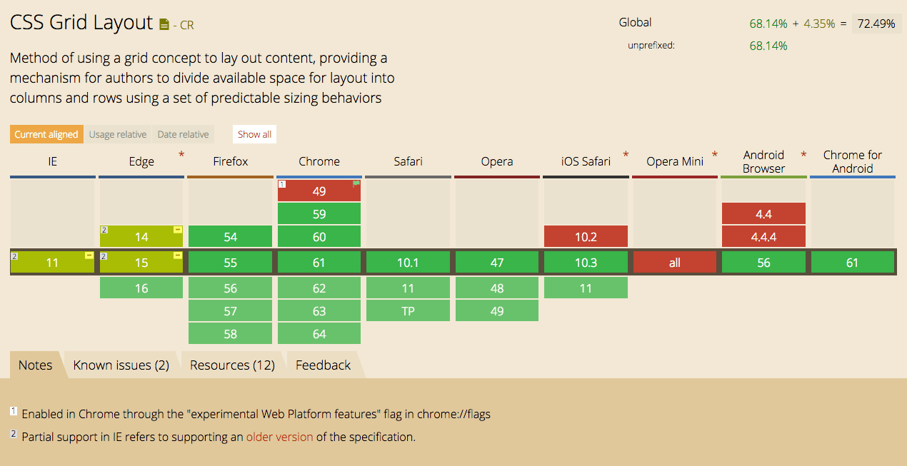
As of September 2017, CSS Grid is supported in Chrome, Firefox, Safari and Opera. It is also partially supported on Internet Explorer 10 and 11 (supporting an older version of the specification), Edge as well as on Android and iOS.
Check Caniuse for up-to-date info.
Learning resources
Hope this gets your feet wet. To learn and practice some more, check out these excellent CSS Grid resources on CSS-Tricks, Grid by Example, and MDN Web Docs. Your can also get some practice on this CSS Grid Playground.
BONUS* – Holy Grail Layout
Achieving the Holy Grail Layout using CSS Grid is even easier than with the Flexbox technique. Holy Grail layout: This is basically a webpage page with a Header, Footer, and Center rows. The center rows may contain the ‘Main Content’ section as well as additional Left and Right columns, which can contain the ‘Navigation’, ‘Ads’ or other content.
