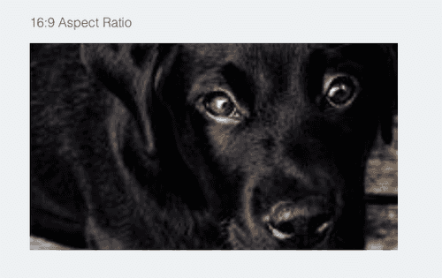
CSS aspect-ratio CSS property
In this series, of exploring CSS functionality from the (hopefully, very near) future, I look at the aspect-ratio property.
Concept
Use of aspect-ratios comes in handy when displaying multimedia (photos, videos etc.) elements on web pages; with some of the common ones we encounter including: 1:1, 3:2, 4:3, 8:5, 16:9.
The idea is that, using the aspect-ratio property you will be able to create boxes that maintain proportional dimensions, with the height and width calculated automatically as a ratio.
It can be used to set a preferred aspect ratio for the box, implying this can be overwritten under special conditions and will be applicable to all elements except inline boxes or table boxes.
It can then be used in combination with other properties such as object-fit to display media as desired. So far, the most common way to implement aspect-ratio in CSS is by using the “padding-top hack” method, but a more native implementation is surely welcome.
Syntax
Demo
Browser Support
Data on support for the mdn-css__properties__aspect-ratio feature across the major browsers
SO in a nutshell, by using aspect-ratio property, changing either the width or height of the box updates the other according to the set ratio to ensure the box resizes in that proportion.